
Standards and Best Practices
These standards and guidelines provide tips for addressing some of the most common accessibility issues and reflect accepted web development best practices.
We aim to meet these best practices with the POUR principles in mind:
- Perceivable: The information should be presented in a way all users can “see” or perceive it. No content should be hidden.
- Operable: The user interface should be operable with any device or software tool, such as a keyboard, touchscreen, or screen reader.
- Understandable: In addition to being able to operate the user interface, users must be able to understand the information presented.
- Robust: Content should adhere to guidelines and best practices to ensure it can be interpreted by a variety of devices and assistive technologies.
- Color Contrast
It's important to ensure foreground and background colors have enough contrast so that people with low vision, color blindness, or other visual impairments can read your content.
To meet WCAG AA compliance for color contrast, visual presentation of text and images of text must have a contrast ratio of at least 4.5:1. Use tools such as the WebAIM Color Contrast Checker to confirm whether your color combinations meet accessibility guidelines.
Within GW's color palette, only certain color combinations meet WCAG AA or AAA guidelines. For text and images with text, be sure to use only approved colors. If you have questions related to the accessibility of GW's color palette, contact visualidentity
 gwu [dot] edu (visualidentity[at]gwu[dot]edu).
 - Charts and Graphs
Creating charts and graphs that follow the Web Content Accessibility Guidelines (WCAG) is crucial for ensuring that everyone can access and understand the information presented. Here are some best practices for creating accessible charts and graphs:
- Repeat data shown in charts as tables.
- Provide text summaries of charts. Note: Include this content in the document itself, do not provide the text summaries as alt text. Some individuals with visual disabilities (color blind, low vision, etc.) might not use screen readers but may still benefit from summaries of charts. WCAG 2.0 Guideline 1.1.1—”All non-text content that is presented to the user has a text alternative that serves the equivalent purpose…”
- Use distinguishable texture, varying line styles, or different shades of color to improve accessibility for colorblind users. Color should not be the only means used to convey information. WCAG 2.0 Guideline 1.4.1—”Color is not used as the only visual means of conveying information, indicating an action, prompting a response, or distinguishing a visual element.”
- Charts should be readable in black and white.
GW staff have access to a web tool called Everviz for creating accessible charts, graphs, and maps that can be easily embedded on webpages or static files. Check out a recorded discussion on Everviz or email onlinestrategy
gwu [dot] edu (onlinestrategy[at]gwu[dot]edu) if you're interested in using this tool.Bar Charts
Bar charts are an effective way to visually represent data, but it's important to follow accessibility best practices to make sure your chart is perceivable and understandable to people with vision impairments:
- Ensure that there is sufficient contrast in the light/dark levels between colors so that colorblind users can tell different bars apart.
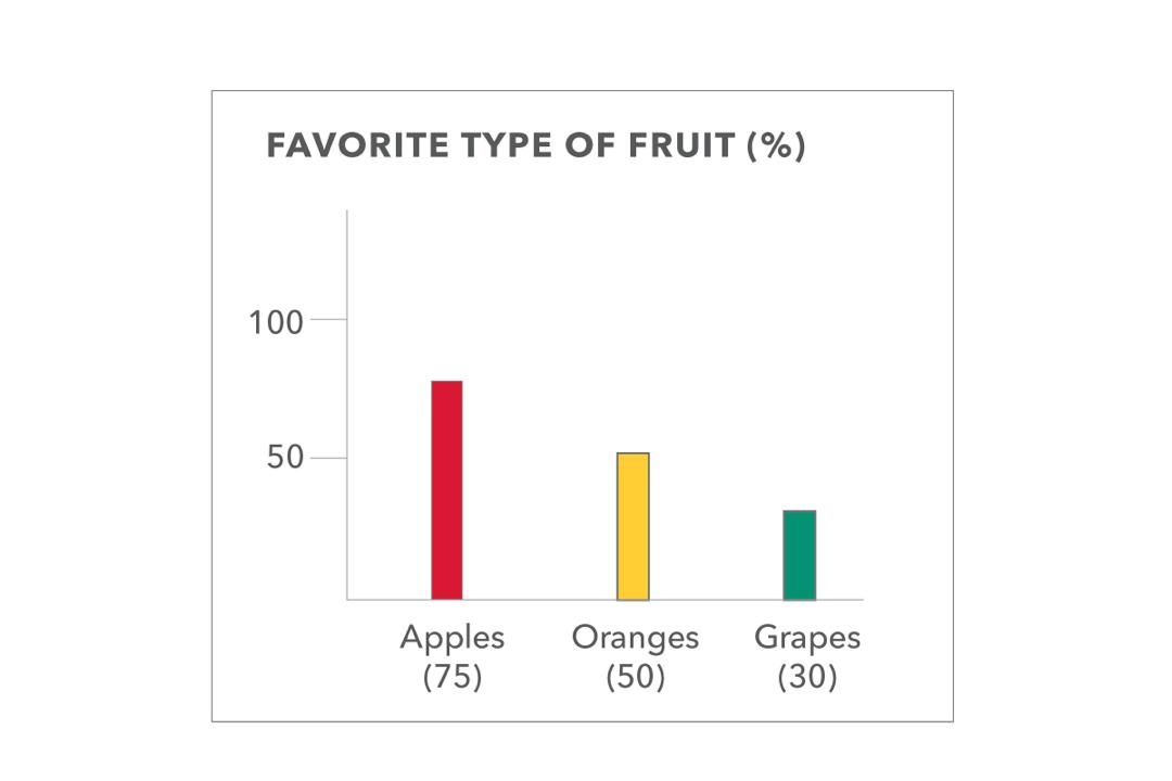
- Label each bar in addition to having a color key. For example, a chart showing 15 apples, 4 oranges, and 3 grapes should be labeled as Apples: 75, Oranges: 50, Grapes: 30 below or next to each corresponding bar.
Below are examples of how both charts and text can be used together to ensure greater accessibility for the visually impaired.
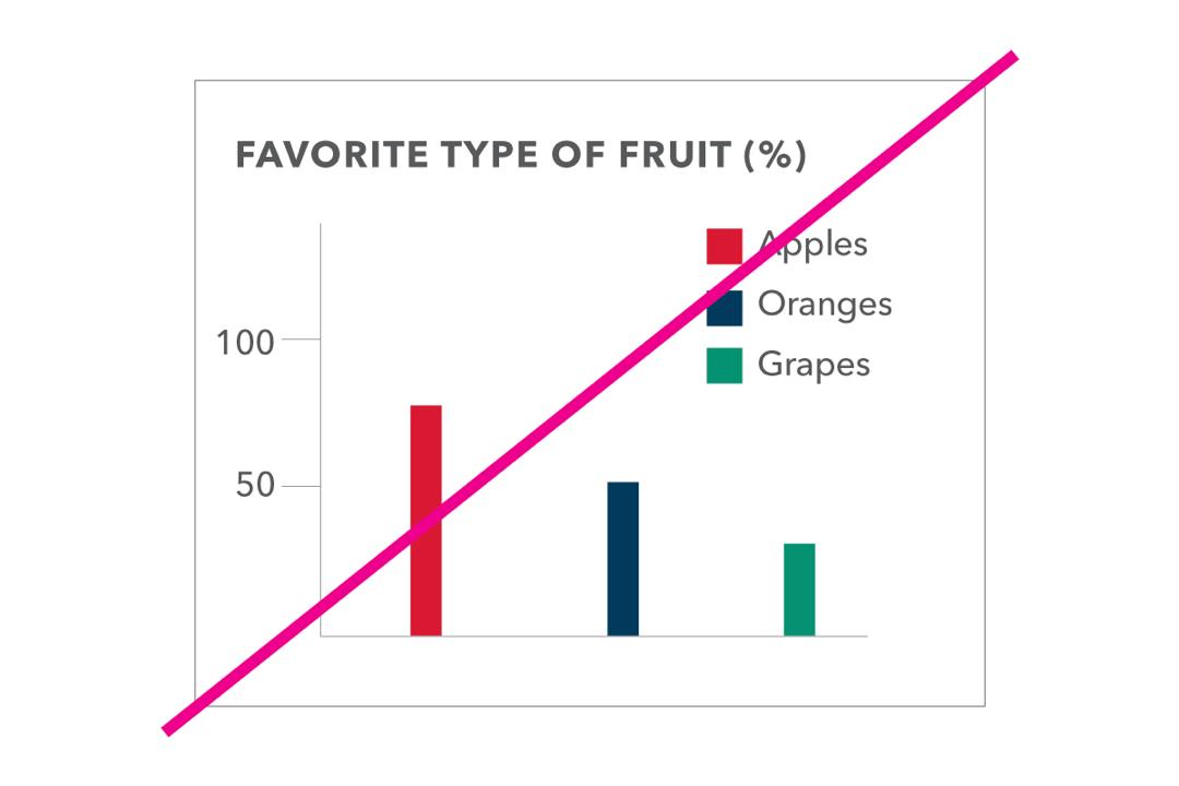
NOT ACCESSIBLE
The colors used are not sufficient in contrast in light/dark levels between colors.

ACCESSIBLE (FOR COLOR)
When designing charts that will be displayed digitally, consider how the work will appear to someone who is colorblind. Clearly labeling each bar with the relevant data will ensure the chart is understandable without relying on color.
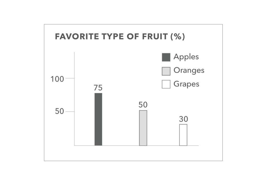
ACCESSIBLE (FOR GRAYSCALE)
When designing charts for print in grayscale, ensure the bars are clearly labeled and/or there is sufficient color contrast and visual distinction between each bar.
Line Charts
Line charts are an effective way to visually display trends and patterns in data, but it's important to follow accessibility best practices to make sure your chart is perceivable and understandable to people with vision impairments:
- Ensure that there is sufficient contrast in the light/dark levels between colors so that colorblind users can tell different lines apart.
- Use different line styles for each line (e.g. solid, dotted, etc.).
- Label data points if they are visually apparent on line charts.
- Label each line (i.e. do not use color alone to indicate which data each line represents).
Below are examples of how both charts and text can be used together to ensure greater accessibility for the visually impaired.
NOT ACCESSIBLE (FOR COLOR & GRAYSCALE)
The colors used are not sufficient in contrast in light/dark levels between colors or in grayscale, data points are not labeled, and the lines are only represented by color and no other factor for the data points on the chart.
ACCESSIBLE (FOR COLOR & GRAYSCALE)
There is sufficient contrast used in the color and grayscale version of the chart, different line styles are used for each line (e.g. solid, dotted, etc.) the data points are labeled.
Pie Charts
Pie charts are an effective way to visually represent proportions and percentages in data, but it's important to follow accessibility best practices to make sure your chart is perceivable and understandable to people with vision impairments:
- Ensure that there is sufficient contrast in the light/dark levels between colors so that colorblind users can tell different sections apart.
- Consider using arrows or “pins” pointing to each piece of the pie chart.
Below are examples of how both charts and text can be used together to ensure greater accessibility for the visually impaired.
NOT ACCESSIBLE (FOR COLOR & GRAYSCALE)
The colors used are not sufficient in contrast in light/dark levels between colors or in grayscale and there are no arrows or pins pointing to each piece of the pie chart.
ACCESSIBLE (FOR COLOR & GRAYSCALE)
There is sufficient contrast used in the color and grayscale version of the chart and pins point to each piece of the pie chart.
- Digital Signage
- All content on digital signage must meet color contrast guidelines.
- Any videos playing on digital signage must be captioned.
- Avoid content that blinks rapidly.
- Images
Alternative Text (a.k.a. Alt Text)
Users with visual impairments, cognitive challenges or technical limitations may not be able to see the images that are on a webpage. For this reason, it is necessary to provide alternative text on all images. The alternative text information is then displayed as plain text, read aloud via a screen reader, or output using a braille reader.
Follow these tips for effective alt text:
- Your text should be descriptive, but not overly verbose. For instance, describe the general activity or name the person in a headshot.
- If there is text in the image, all of that text must be included in the alternative text field.
- For this reason, it is not recommended to repurposes posters as images, especially not as a solution to providing critical information.
- Do not use file names such as "photo1821.jpg"as alternative text, as this provides no meaningful information for someone who cannot see the image.
- Redundant words such as "image of" are not necessary, as a screen reader user will typically already know they have encountered an image.
Examples of Alt Text on Images

Good: Spring flowers bloom across Kogan Plaza
Okay: Kogan Plaza
Bad: Kogan
Good: GW Chair of the Board of Trustees, Grace E. Speights
Okay: Grace E. Speights
Bad: Speights headshot
Good: Accessibility at GW
Okay: Accessibility graphic
Bad: graphicLong Descriptions in the Alt Attribute
When images require long descriptions, such as when describing points on a map or complex graphs, you may place the text on the same web page as the image and use alt-text to describe its location. The location information should be clear and accurate to help users locate the content. Refer to the W3C guidelines for more information.
Text on Graphics
When possible, use text rather than images to convey information. Text can be magnified, interpreted as braille, or read aloud using screen readers by visually-impaired users.
Using text on graphics is not best practice and should be avoided when possible. However, in instances where text inside of graphics is used (e.g., logos), you must provide alt text that communicates the text to screen reader and assistive technology users.
Color Contrast
If your image includes text or is otherwise critical to understanding the content on your page, the colors used must adhere to WCAG AA color contrast ratios.
- Links
Provide Context
Assistive devices do not look to see where you are linking to. They look at the link text and what you say you are linking to.
For that reason, links should always be contextual, meaning that the linked text should be the plain language description of:
- the content you are linking to,
- the document you are linking to, or
- the action the user will take
In the same way that a screen reader can "scan" a webpage to only read the subheads, it can also "scan" the page to only read the links aloud. When that happens, it's important for the link text be a clear indicator of what's after the click.
- Do not use the raw URL
- Ex: www.gwu.edu
- Do not use vague language, such as 'click here', 'read more' and 'more information'
- Do not use the same language to link to different things on the same page
- Ex: linking "Program Information" in two places on the same page to two different programs
Examples of strong vs weak link text:
Bad: For more information about the university, go to www.gwu.edu.
Bad: For more information about the university, click here.
Weak: More information about the university can be found on the George Washington University website.
Stronger: More information about the university can be found on the George Washington University website.
Strongest: More information about the university can be found on the George Washington University website.Linking to documents
When linking to documents, it's important to include the document type in parentheses and to include that parenthetical in the link. Some document types are more accessible than others, and different devices will treat document links differently than website links. For instance, some mobile phones will download documents automatically when a document link is clicked, giving no warning to the user.
Providing the context that the link is to a document lets users make the decision on how to proceed before clicking the link. Some users may opt to call in for assistance, while others may choose to switch devices for a better user experience.
For example: GW's Brand Guidelines (PDF) provide in-depth information and guidance on how to properly use the university's logos and branding components for a variety of use cases.
Styling
Color should not be the only indicator used to communicate a link. Indicate links using a variety (at least two) of indicators. Indicators can be things such as colored text, styled text (e.g., underlined, weighted, or italics), etc.
Watch the video below to see how screen readers navigate and interact with links.
- Mass Email
- All images must include appropriate alt text.
- All text within the email body and in graphics should meet color contrast guidelines.
- Use of text headings should follow best practices.
- Microsoft Office Documents
Microsoft Office documents should meet accessibility guidelines, including:
- all images must have alt text
- headings are used properly throughout the document
- a logical flow for someone navigating the document using a screen reader
When possible, consider whether the content must be posted in a Microsoft Office format or if it could be posted online as a webpage.
GW IT offers Microsoft Office 365 free to all students, faculty and staff. We recommend using this tool and taking advantage of its built-in accessibility features.
- Page Titles and Headings
Assistive technologies rely on the markup of a page to determine structure. This in turn allows users of those technologies to skim page content just as a non-disabled person would. Keep these best practices in mind when setting up headings:
- Page titles and headings must be presented in a logical, chronological order
- H1 tags should be used only once per page and be followed by H2, H3, all the way to H6 tags where applicable
- Do not skip levels (e.g., H2 followed by H4)
- Do not use text formatting, such as font size or bold, to give the visual appearance of headings when structured heading options are available
- Do not use structured headings to achieve visual results only, for example: setting your first paragraph as H1 because you want it to be a large font
Effective use of headings also promotes better indexing with search engines. What's good for accessibility is often good for search engine and AI optimization.
Watch the video below to see how screen readers navigate and interact with heading structures.
- PDF Documents
PDF documents should meet accessibility guidelines, including:
- all images must have alt text
- headings are used properly throughout the document
- a logical flow for someone navigating the document using a screen reader
When possible, consider whether the content must be in PDF form or if it could be moved to a webpage.
Do not post PDFs that are one single graphic.
- Social Media
Social media websites give you plenty of tools to make your posts accessible, if you know where to look. Here are GW's expectations and where to find accessibility features on Twitter, Facebook, and Instagram.
X
All images must have alt text. After you add images to tweets you will have the option to "add description" which can be used to add alt-text to your image prior to posting the tweet.
Videos must be captioned. You can add captions to a video by following instructions from the X Help Center. Upload your video and caption file there before you post it.
Facebook
All images must have alt text. Facebook will auto-generate alt text when you post images, but sometimes you'll want to write your own, especially if your image has text. You can edit the alt text after you post by going into “Options”, a link in the bottom-right corner when you’re looking at an image.
In general, however, we recommend avoiding large amounts of text on Facebook images.
All videos on Facebook must be captioned.
Instagram
All images must have alt text, and/or any text represented in the image should also be in the post description. Add alt text to your images by tapping on “Advanced Settings” when you’re creating a post. You can always go back and edit the alt text after you post on Instagram.
When posting Instagram Stories, make sure your text has enough contrast with its background color.
LinkedIn
All images must have alt text, which is referred to as the "image description".
- Third Party Software and VPATs
Third party software tools used to conduct business at GW, such as Calendly or Salesforce, must meet WCAG AA standards. This includes software obtained via formal contract process and purchase order as well as smaller tools purchased via PCard.
While some aspects of third party software tools are outside our control, GW departments are expected to do their due diligence on the following:
- Ensure all software configurations pertaining to the visual template, such as color palette and or a GW-branded template, meet color contrast guidelines
- Obtain a Voluntary Product Accessibility Template (VPAT) document from the vendor so that GW has a record of the tool's current accessibility
- Don't take the VPAT at face value – review it with the vendor to be sure you understand the nuances of any accessibility issues in the product
- When evaluating competing products, it's recommended that the VPAT responses from each vendor are factored into the decision making process
Also, be aware that GW's standard terms and conditions include language related to digital accessibility. If you have digital accessibility questions related to procurement, contact the GW Procure-to-Pay office or the GW IT Contracts team.
- Video Content
As with all digital content, videos posted on websites or social media need to be in compliance with accessibility laws. In most cases, this requires some combination of captioning and/or written transcripts.
Produced Videos
For non-live video captioning we recommend Rev, which charges a nominal fee to run the captions. Always check these for accuracy before posting. Videos under 10 minutes are usually captioned within 24 hours.
Livestream Videos
For live captioning when we stream video, we recommend AI Live. Schedule your live captioning at least 72 hours in advance.
Spontaneous live streams, such as those you might do "in the moment" for social media, must be captioned within 48 hours.
Several social media sites, including Facebook and YouTube, have step-by-step instructions for captioning videos. On both sites captions can be automatically generated or you can upload a file. You’ll still need to review these auto-generated captions because they’re not always 100% accurate.
Videos with Visuals
If your video leans heavily on visuals, consider the experience for someone who is blind or low vision. If the visuals are key to understanding the video, create a written transcript that can be read with a screen reader. Don't forget to ensure that all visuals meet color contrast guidelines.
Videos with Music
Videos that contain music between dialogue or music with no dialogue must still contain captions to indicate when music is playing. This is important so users know they are not missing any other dialogue or verbal prompts. Examples for captioning musical content may include "(Music playing)" or "(Classical music playing)."
Read more about making audio and video media accessible from the W3C Web Accessibility Initiative.


Have questions? Email onlinestrategygwu [dot] edu (onlinestrategy[at]gwu[dot]edu) or schedule virtual office hours with the Office of Communications and Marketing Web Strategy and Support team.